
03 / 01
Logomark
Shorthand for the visual identity. Use for internal contexts or sign-offs where the brand is already established.
mark_[color].[file-type]
Cedar Creative
Visual Identity Guidelines
These guidelines are intended to help guide and inspire you as you bring the visual identity to life. Before you create new assets, consult these guidelines to ensure you're on the right track. You can also share this website with any partner agencies, writers, or designers who may be creating the work for you.
This is not an exhaustive representation of all visual elements, however it is intended to serve as a starting point for documenting fundamental aspects of the visual identity like the logo and color. As the visual identity evolves, this website should be updated accordingly.

02 / Strategy
Cedar tells stories through high-quality films for nonprofits, higher education, and corporate clients. Cedar is not a vendor. Cedar is an architect of story, a creative partner that brings vision, taste, and perspective to every project.
Cedar Creative
Positioning
"Every organization has a story worth telling. Cedar makes films that create connection and move people to care, to act, and to believe. When you need more than production, when you need perspective, ideas, and a creative partner who will surprise you, you call Cedar."
The Triangle
Cedar operates on a three-part framework, nature's strongest shape, where every element holds the others in tension.
01
The business must be sustainable. Great creative work requires a healthy foundation, and Cedar treats profitability not as a compromise but as the fuel that makes everything else possible.
02
Every project should produce work the team is proud of, work they want to see exist in the world. Cedar invests in personal projects, non-billable exploration, and a culture where curiosity is the norm, not the exception.
03
Sustainability applies to people, not just finances. Cedar is built for the long term, which means maintaining a pace that keeps the team sharp, healthy, and genuinely excited to show up.
Audiences
Nonprofit Organizations
Cedar's emotional storytelling roots run deepest here. The proving ground for every other category.
Higher Education
Institutions that need to communicate mission, culture, and identity through story.
Corporate & Industrial
Larger budgets, faster timelines, and a hunger for work that rises above typical corporate production.
03 / Logos
The logo is the most recognizable mark of the brand. This section covers its forms, spacing, and the best times to use each version so Cedar always shows up looking like Cedar.
Cedar Creative
03 / 01
Shorthand for the visual identity. Use for internal contexts or sign-offs where the brand is already established.
mark_[color].[file-type]
03 / 02
Type-only lockup. Use when the full company name is needed but separate from the mark.
cedar_creative_[color].[file-type]
03 / 03
Shorthand logotype, type-only. Pairs with the mark in custom layouts.
cedar_[color].[file-type]
03 / 04
External communication where Cedar may not be familiar to the audience.
mark_cedar_creative_[color].[file-type]
03 / 05
Internal or less buttoned-up contexts.
mark_cedar_[color].[file-type]
04 / Logo Misuse
The Cedar marks should always feel deliberate and intentional. These are the most common ways the identity gets pulled off-brand. If a use looks like one of these, it isn't Cedar.
Cedar Creative
04 / 01
04 / 02
04 / 03
04 / 04
04 / 05
04 / 06
05 / Color
Color carries much of the feeling of the brand. This section defines the Cedar palette, how to balance it across applications, and how each color should be used to keep the identity consistent and intentional.
Cedar Creative
05 / 01
These primary colors form the core of the Cedar visual palette. Click any value to copy it. Cedar Green leads, Charcoal and Off-White anchor, Cedar Yellow makes the moment.
05 / 02
Use only these foreground and background pairings. Each one clears contrast and keeps the palette intentional.
Aa
Light Green on Cedar Green
Aa
Off-White on Cedar Green
Aa
Off-White on Charcoal
Aa
Charcoal on Cedar Yellow
Aa
Cedar Green on Light Green
Aa
Charcoal on Warm Gray
06 / Typography
This section covers the Cedar typefaces, how to pair them, and the hierarchy that keeps every piece of communication clear, confident, and unmistakably Cedar's.
Cedar Creative
06 / 01
Suisse Intl. is a clean, modern grotesque that's approachable at display sizes and stays legible at body copy.
06 / 02
Type whatever you like. Drag the slider to scale. The reference, in your hands.
06 / 03
Suisse Intl. Mono for spec callouts, captions, and machine-feeling metadata. Use Regular only.
06 / 04
The default scale for editorial moments. Click any line to copy its CSS.
Headline 1 · Suisse Intl. Book 85pt
Headline 2 · Suisse Intl. Book 36pt
Subcopy · Suisse Intl. Book 18pt
Body Copy · Suisse Intl. Regular 12pt
07 / Layout
This section outlines the grid, spacing, and composition principles that give every Cedar asset room to breathe and the structure to feel intentional.
Cedar Creative
07 / 01
Cedar layouts use a 10×10 grid. It guides spacious compositions that convey confidence, boldness, and leave room for the work to make an impact.
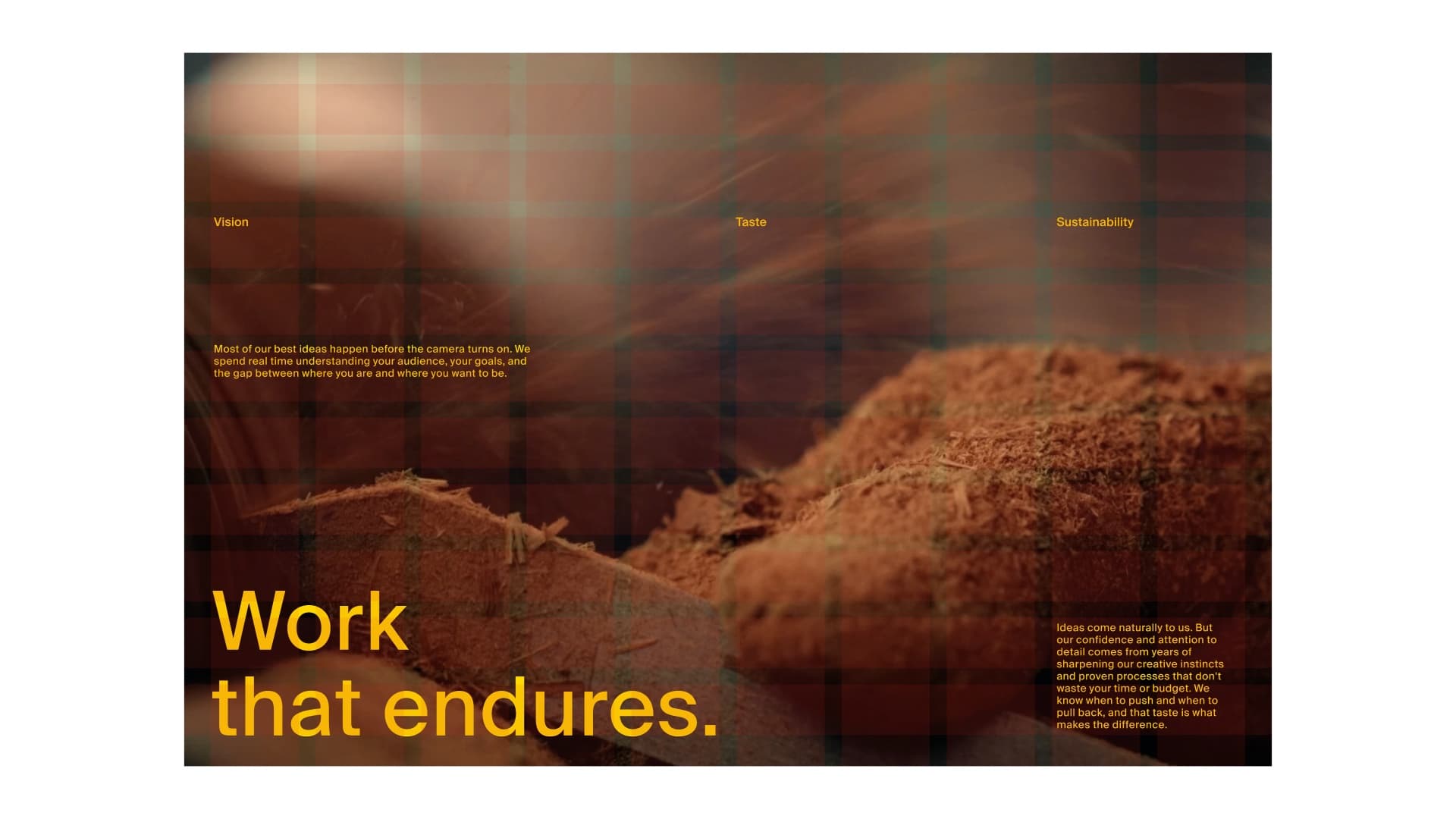
07 / 02
The 10×10 extends into motion, a helpful resource for type-shifting intros and title cards.
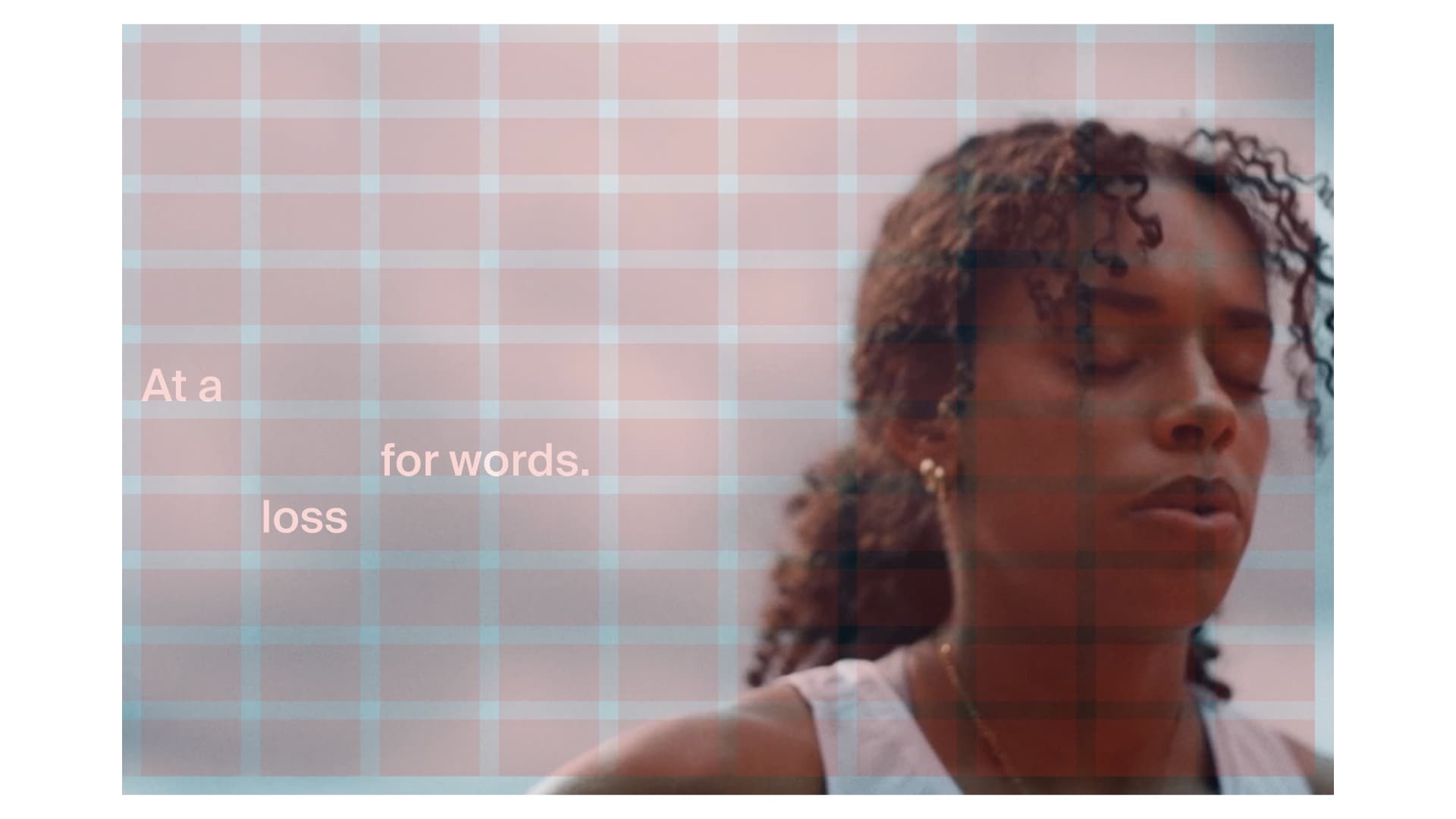
07 / 03
The same grid carries into key art and posters, holding type and imagery in a balanced, unmistakably Cedar composition.
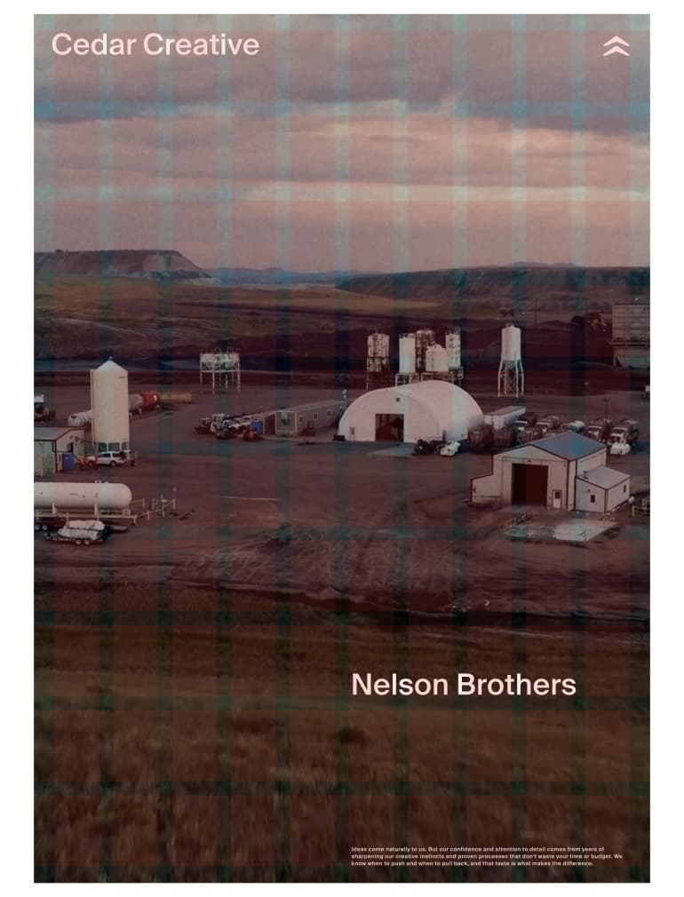
08 / Icons
This section covers the Cedar brand element icons, their meaning, and how they were created to reinforce the craft and clarity of the rest of the identity.
Cedar Creative
01 / Brand Element
Cedar walks into every project looking for the conflict, story, and real people living it. The creative comes easy, the natural result of deep talent, relentless curiosity, and a team that never stops sharpening its craft.
02 / Brand Element
Having great ideas is only half the work. Having the confidence to say which one is right takes time. It takes a sharp eye and trusted gut to strip it back and let the right answer surface.
03 / Brand Element
Cedar is built for the long term, in the work, the partnerships, and the business behind both. Films are designed to last, relationships assumed to grow, and every decision is balanced against the studio's integrity.
09 / Voice & Tone
Cedar's voice is confident, direct, and human. We talk like creative partners, not vendors. We lead with insight, never buzzwords. And we always sound like a team that's done the work.
Cedar Creative
09 / 01
Confident
Cedar takes a position. Direct, never hedged. We say what we think, and we mean it.
Editorial
Restraint over flourish. Specifics over abstraction. Strip back until the right answer surfaces.
Warm
Cedar is a partner, not a vendor. The voice should feel like a creative friend who's done the work.
Curious
Lead with insight. Cedar walks into every project hunting for the real conflict and the real people.
09 / 02
10 / Messaging
Cedar's messaging is built on three core values that show up in everything we make, from the brief to the final cut. Each one is a lens for what to greenlight, what to push back on, and what makes Cedar Cedar.
Cedar Creative
Brand Pillars
01
Cedar walks into every project looking for the real conflict and the real people living it. Ideas overflow naturally, the product of deep talent, relentless curiosity, and a team that never stops sharpening its craft. The creative is the easy part.
02
Having great ideas is only half the work. Someone has to be confident enough to say which one is right. Cedar's instinct is to strip it back and let the right answer surface. That editorial discipline is what separates work that feels effortless from work that feels overproduced.
03
Cedar is built for the long term, in the work, the partnerships, and the business behind both. Films are designed to last, relationships assumed to grow, and every decision is balanced against The Triangle: financial stability, creative fulfillment, and a healthy team.
Messaging Lines
Creative vision. Lasting work.
Impactful stories deserve bold ideas.
Work that endures.
11 / Application
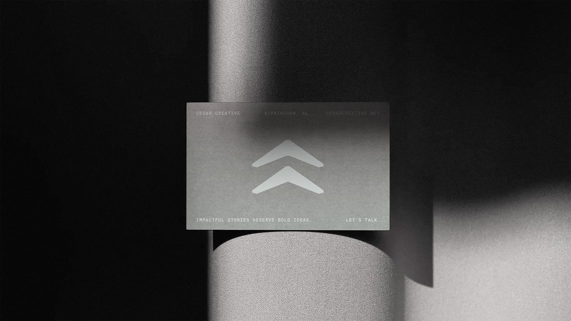
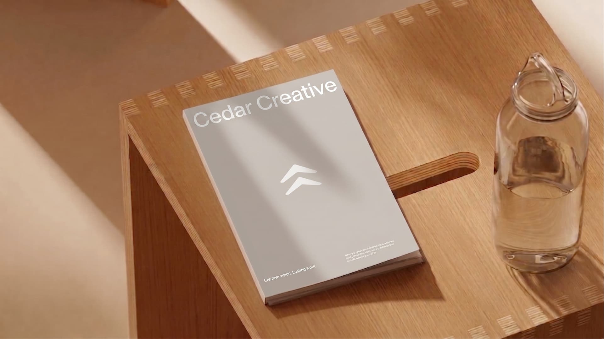
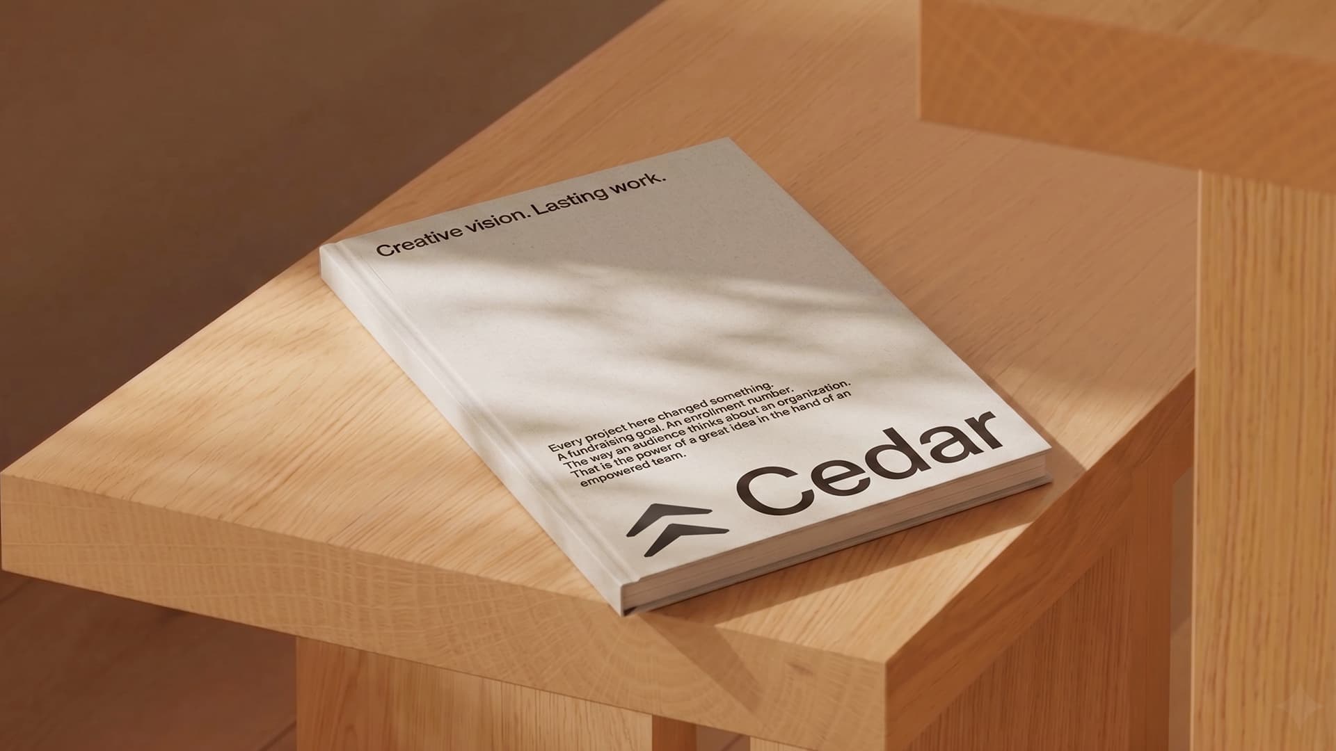
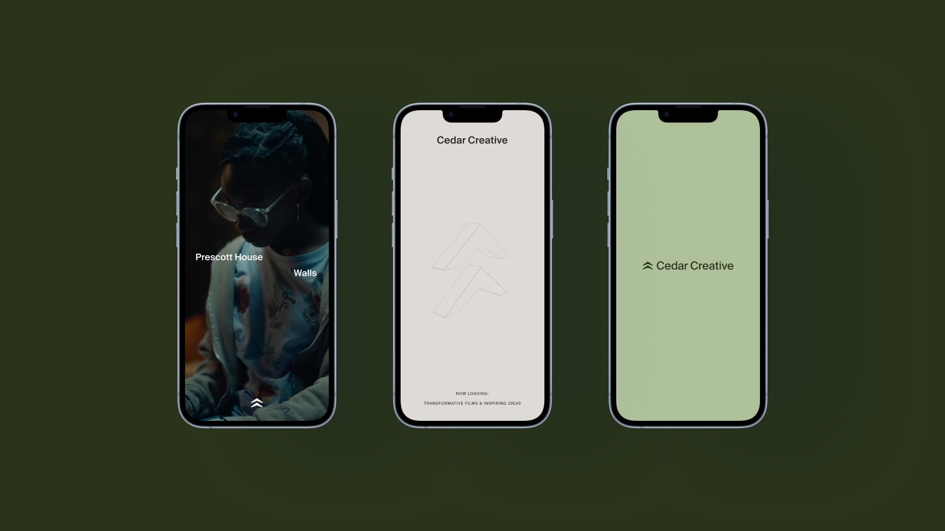
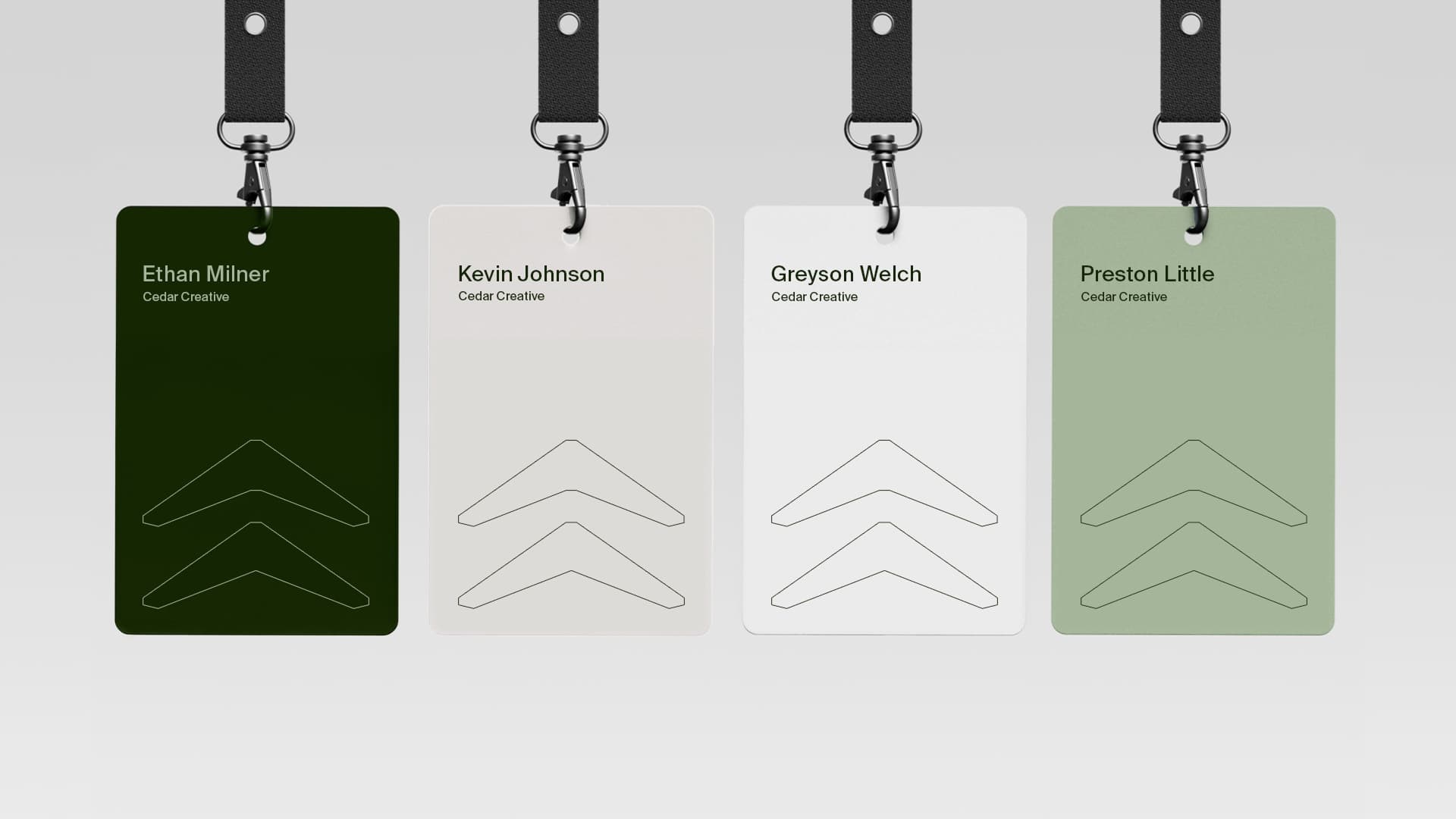
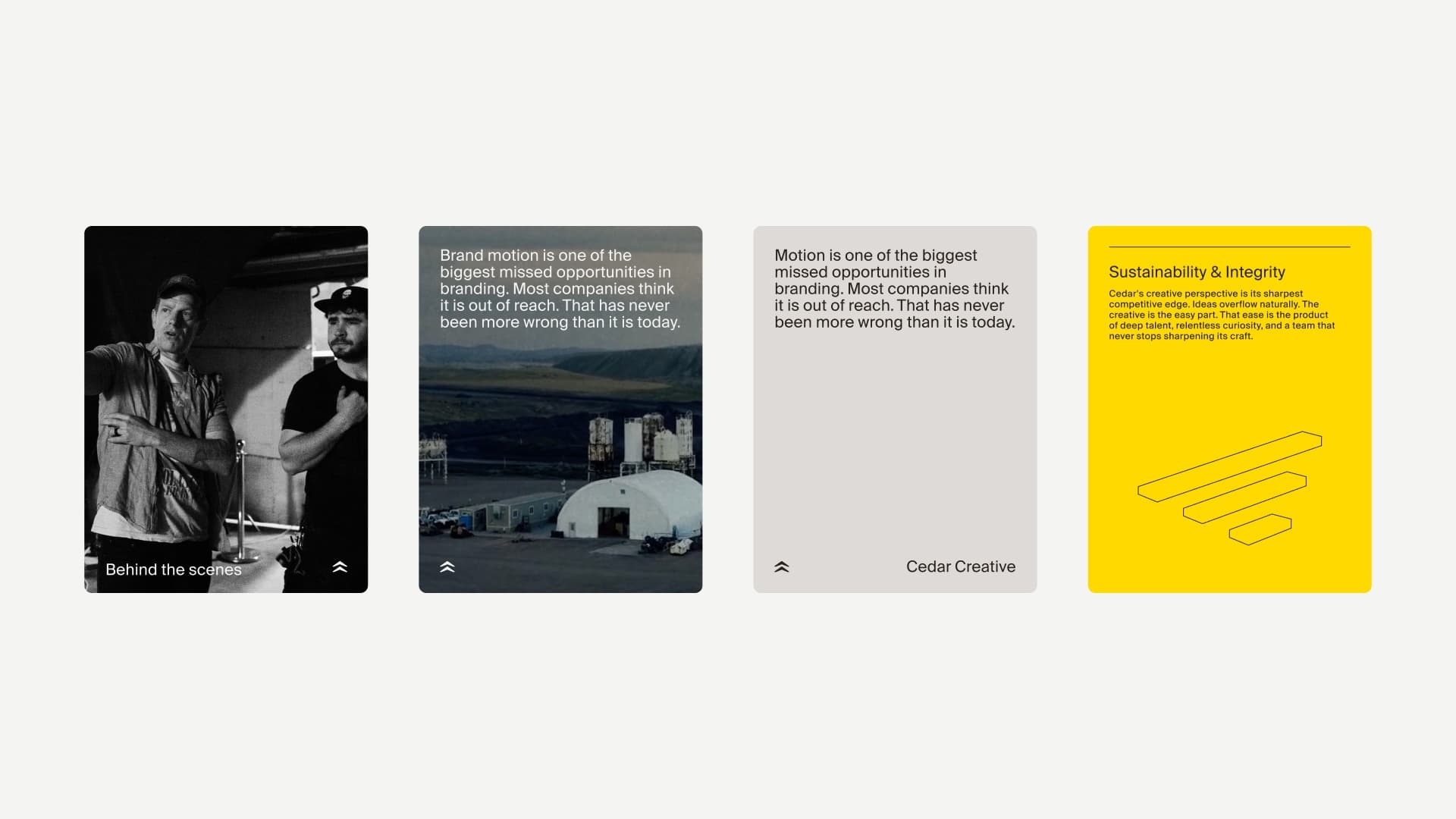
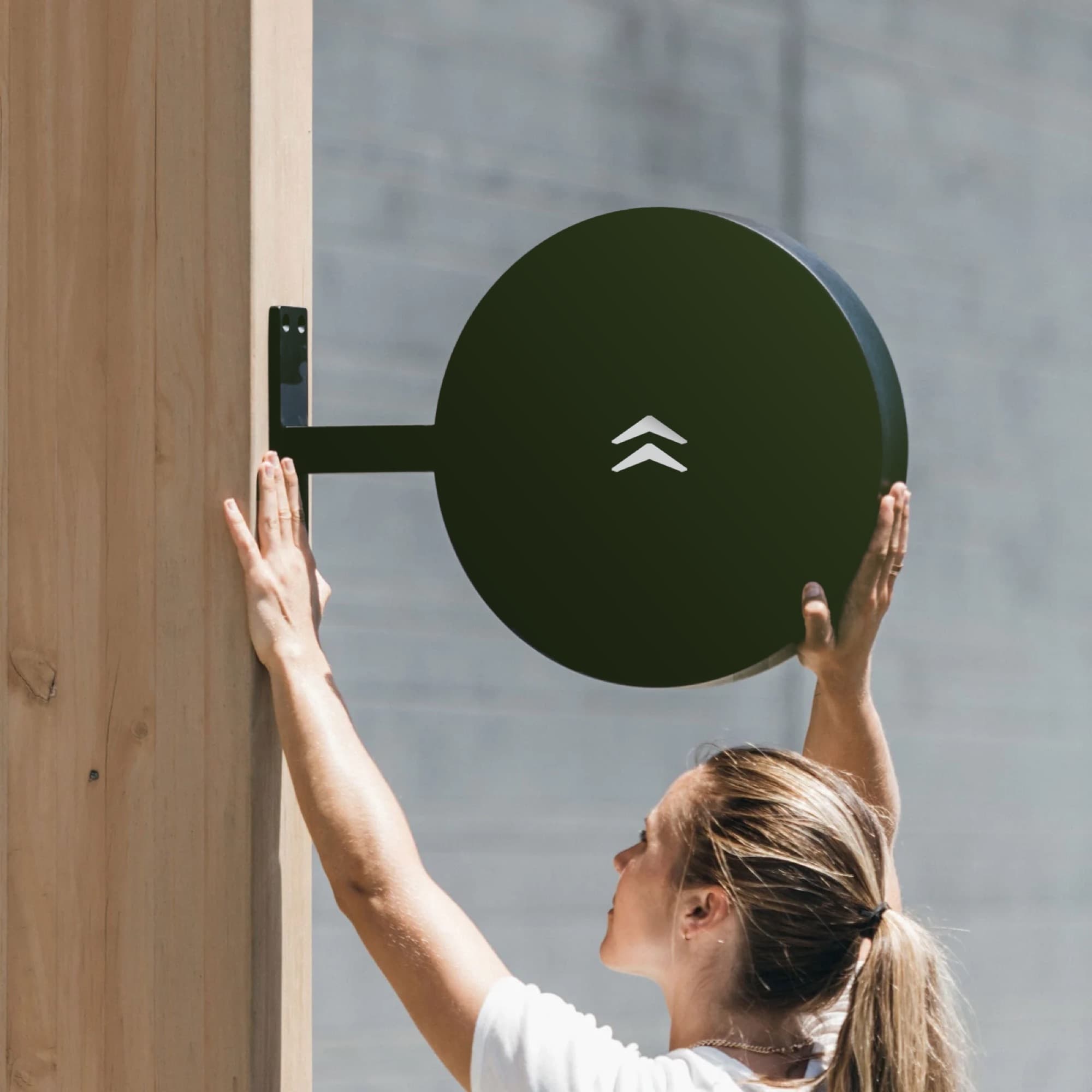
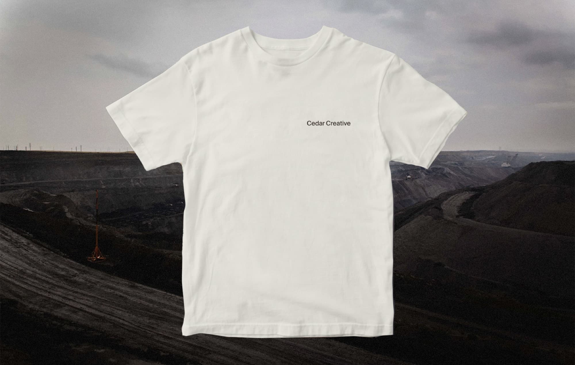
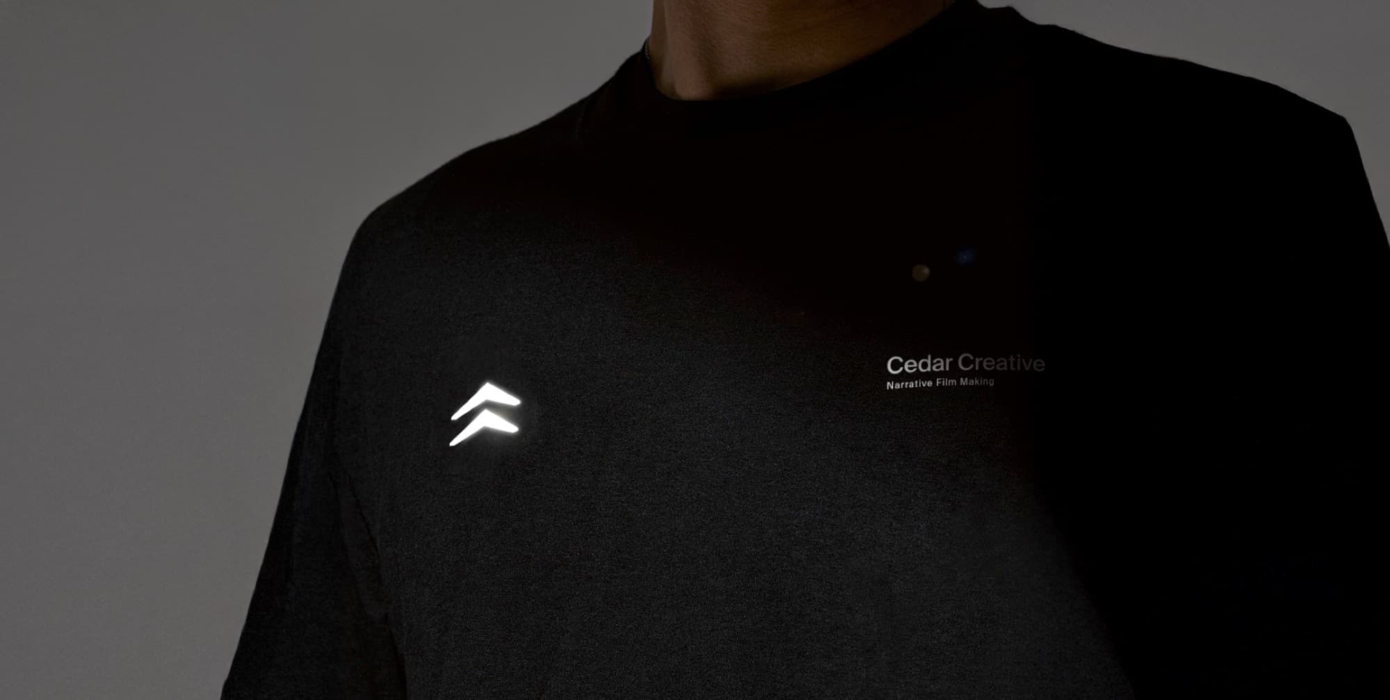
The following examples show the brand in action across real surfaces. Use them as a reference for how Cedar comes together in print, digital, and environmental contexts, and as inspiration for what to build next.
Cedar Creative
12 / Asset Bank
Every working file, in one place. Click any item to download. The brand pack is everything in a single zip.
Cedar Creative
Quick Grab
All logos, all licensed font cuts, the Brand Colors PDF, and the full guidelines, all in one zip.
Brand Pack (~83 MB)
Logos
All Logos gathers every lockup in all six brand colors. Each pack below is a single lockup in all six colors, as SVG, PDF, EPS and PNG.
Fonts
All Suisse Fonts bundles all six cuts as woff2. Licensed via Swiss Typefaces; EULA included in the pack.